
Margalida Vinyes dona vida al calendari de l’Autoritat Portuària de Balears 2025
Palma
12/12/2024- Port-city
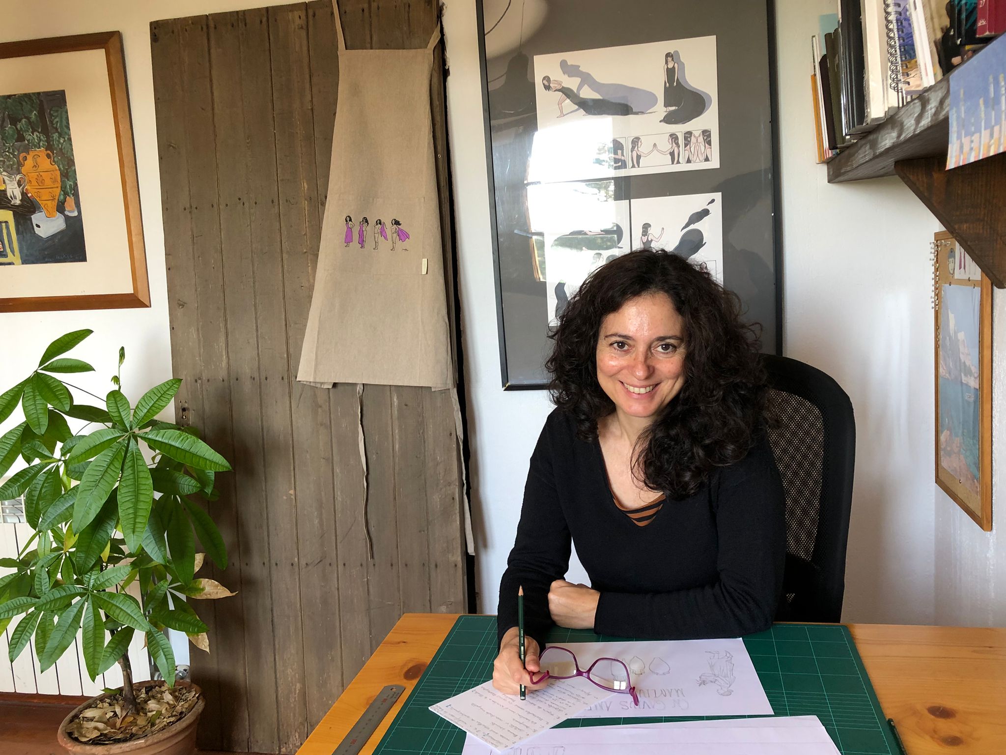
Margalida Vinyes, one of Mallorca's most prominent illustrators, has been commissioned to create the illustrations for the Port Authority of the Balearic Islands' 2025 calendar, dedicated to the port of Alcúdia. Her unique style and deep connection to the island's landscapes make this project a visual tribute to the islands and their ports.
Margalida, tell us what this assignment has meant to you.
As an illustrator, this project has allowed me to illustrate the landscapes of my homeland. It has also been an opportunity to capture how I experience my region.
The calendar focuses on the ports of general interest in the Balearic Islands. How do you draw inspiration to capture the essence of these spaces so closely linked to the sea and island life?
In general, my illustrations are contemplative, with small details, pleasant to look at and recognisable.
As for the port of Palma, I know it very well, since I am from here. Even so, I walked around the entire port to capture different perspectives. I like to observe and search for details. But the truth is that I knew I wanted to draw a mooring bollard. I also saw that there was a colony of cormorants. That's how I got the idea of depicting a cormorant on top of a bollard.
I spent the whole afternoon walking around Alcúdia. Architecturally speaking, the port isn't very eye-catching. That's exactly why I focused on the sculptures that adorn the promenade.
In the case of the port of Mahón, I asked my cousin to take photographs from different angles. One of them was of the Sirena de Mô, and I decided that this statue would be the main feature of the illustration, adding a small bird that is often seen on the island of Menorca, the bee-eater.
In contrast, the illustration of the port of Ibiza is more postcard-like, very contemplative. It's the first image you see of the island when you arrive by boat.
Was there a particular port or scene that you found most special or emotional to illustrate?
Drawing the port of La Savina was the most complicated because it was difficult to recognise the location. In the end, I decided to draw the ferry terminal, with its distinctive blue columns and the sculpture of a heart on the terrace.
Your work has a very distinctive style. How would you describe your visual language? What techniques did you use to create the illustrations?
My style is a combination of comics, following the clear line style, and figurative illustration, with a strong focus on details.
The technical process begins with pencil sketches and continues with clean lines in wax pencil. I like black to stand out in a very pure way. Finally, I finish the process digitally with vivid colours that accentuate the shapes and textures.
How was the preliminary research process? Did you visit the ports in person or did you rely on photographs and documentation?
I generally spend more time on documentation than on execution. I like to photograph landscapes in person, from the angle and perspective that most appeals to me from an artistic point of view. But when it's not possible to be on site in the spaces I have to illustrate, I use technology, such as Google Earth.
This balancing act between direct exploration and digital tools has allowed me to capture the uniqueness of each of the islands' settings.
The figure of the woman plays an essential role in your illustrations, as do the animals. Why?
All the illustrations feature a character, whether it be an animal, a person or a sculpture. When it comes to women, I always try to depict them in occupations where there are few women, such as fishing. Illustrations are a testament to an era, but they also help to project the world we would like to live in.
However, the land does not belong only to us, to people; it also belongs to the flora and fauna. That is why I also wanted to give animals a leading role. Furthermore, having an animal as a reference point has been the perfect excuse to situate myself in the scene. For example, the donkey in the illustration of the Cala Figuera lighthouse alludes to the Mallorcan landscape. Similarly, the goat refers to the Serra de Tramuntana mountains, the lizard to Formentera and the bee-eater to Menorca.
The cormorant and the dolphin are the only two marine animals that appear in your illustrations. Why?
I love the sea, but I prefer to look at it from land. I'm not a seafaring person. Therefore, all my views are from land towards the sea.
Were you familiar with all the unique characteristics that differentiate each of the Balearic lighthouses?
Once I realised how diverse lighthouses are, I thought it would be a good idea to put them all together so we could see what a treasure we have. This fun composition, featuring 12 lighthouses in different shapes and colours, ended up becoming the Christmas card. I also wanted to avoid the typical image of lighthouses at night, with their light shining brightly. Instead, I wanted to paint the minutes that pass between sunset and when the lighthouse lights come on.
From a more visual and artistic point of view, the lighthouses with black and white lines are very interesting. They are more aesthetically pleasing and attract more attention. You could even say they are more romantic. In fact, they remind me of a Christmas lollipop.
What do you hope the public will perceive when they see the calendar? What message or emotion do you want to convey with your illustrations?
I wanted to convey the beauty of our islands and the need to protect their landscapes and living beings. With these illustrations I would like to invite you to contemplate and appreciate the cultural and natural wealth that we have in the Balearic Islands.
Related documents